
Custom dashboard interfaces often need more than default line charts, bar charts, and simple color settings. Product dashboards, internal analytics tools, monitoring systems, operational panels, SaaS reporting pages, and data-heavy admin interfaces all depend on charts that match the workflow. Dashboard teams may need custom styling, annotations, zooming, panning, tooltip logic, layout control, and chart behavior that feels native to the product. The chart library affects both frontend development and the way users read data inside the interface. A weak charting layer can force design compromises or technical rewrites later.
This list focuses on libraries that help teams shape dashboard visuals and interactions in different ways. Some tools are better for performance-heavy custom dashboards, while others are more useful for clean standard charts, configurable visuals, or analytical dashboard views. This is not a generic popularity ranking. The comparison looks at chart control, styling, interaction options, implementation effort, documentation, and realistic product use. Below is what we selected and why.
How We Picked These Dashboard Charting Tools
Custom dashboards need to be judged by more than how nice the demo looks. A useful charting library should fit the product UI, support the needed interactions, and stay manageable as dashboards become more complex. Teams should look at styling control, chart behavior, data size, framework fit, examples, documentation, and long-term maintenance. The four tools below represent different approaches to custom JavaScript dashboard charting. Each one covers a different level of control and technical depth:
- SciChart: For data-heavy custom dashboards, advanced chart behavior, annotations, and browser-based interaction;
- ApexCharts: For polished dashboard charts, smooth setup, and clean standard visuals;
- RGraph: For configurable JavaScript charts with several chart types and practical setup options;
- Taucharts: For analytical dashboard views, declarative-style charting, and data-focused interfaces.
These tools are not interchangeable. Each one suits a different type of customization. SciChart comes first as the option for dashboards where custom behavior and data load matter most.
1. SciChart
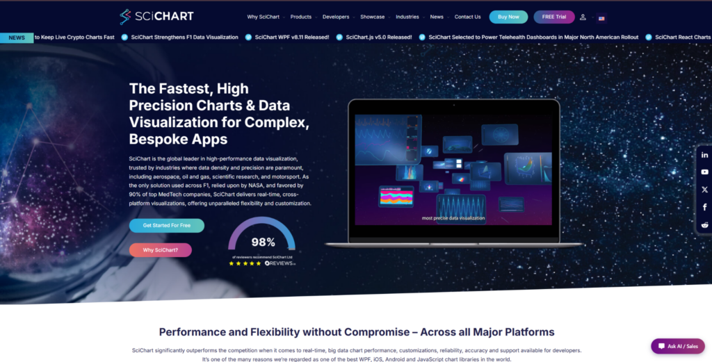
SciChart fits custom dashboard interfaces where charts need advanced behavior, detailed interaction, annotations, styling control, and browser-based visualization. Teams can use SciChart for custom JavaScript charts in trading dashboards, engineering tools, medical interfaces, monitoring products, scientific platforms, and operational analytics. It is not the easiest option for a basic dashboard page. SciChart is most relevant when the chart layer is a serious part of the product workflow. Its value becomes clearer when users depend on charts to inspect, compare, and act on data.
Custom dashboards often require more than visual settings. Users may need to zoom, pan, inspect points, compare values, follow live updates, and work with dense datasets inside the same interface. The library supports 2D charts, 3D charts, heatmaps, gauges, polar charts, annotations, and custom behavior. Documentation, examples, demos, and implementation support reduce risk when building advanced dashboards. SciChart is commercial, so it is easier to justify when chart interaction and performance matter to the product.
SciChart’s value comes from the mix of rendering speed, chart depth, interaction control, and production support. It handles browser load well and keeps interactions smooth in demanding dashboard scenarios. The main reasons to consider it are practical:
- Handles large datasets and frequent updates in custom dashboard interfaces;
- Supports advanced visuals such as 2D charts, 3D charts, heatmaps, gauges, and polar charts;
- Gives developers control over annotations, styling, interactions, and chart behavior;
- Fits technical dashboards where users need to inspect and compare data directly;
- Provides examples, demos, documentation, and support for production implementation.
Consider SciChart when charts are central to how users work with data, not just a decorative dashboard element. It may be too much for a simple reporting page, but it is relevant for products where chart limits would hurt the user experience. For more standard dashboard UI, ApexCharts offers a different tradeoff.
2. ApexCharts
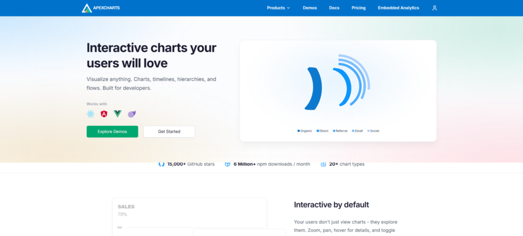
ApexCharts is a good option for teams building polished dashboards with standard chart types and a clean visual presentation. Use cases include SaaS dashboards, admin panels, business reports, customer-facing analytics pages, and internal data views. Its appeal comes from attractive defaults, useful chart types, and a setup process that feels manageable for many frontend teams. It is not a direct replacement for SciChart in heavy data or technical visualization scenarios. ApexCharts is more relevant when teams want clean dashboard charts without building everything manually.
Many custom dashboards do not need advanced rendering engines, but they do need charts that look good and behave predictably. ApexCharts helps when the interface needs line charts, bar charts, area charts, mixed charts, tooltips, legends, and responsive layouts. It is useful when chart customization is needed at the UI level rather than deep technical chart behavior. Teams should still test it if they expect large datasets or frequent live updates. Its strongest use cases are familiar dashboard views where presentation and implementation speed matter:
- Covers common chart types used in SaaS dashboards and reporting pages;
- Offers polished defaults that reduce visual design work;
- Supports responsive layouts, tooltips, legends, and dashboard-friendly interactions;
- Fits teams that need clean charts without a heavy implementation process;
- Makes sense when dashboard presentation matters more than deep technical rendering.
ApexCharts is useful for clean dashboard interfaces, especially when the charting needs are familiar and product-facing. It is less suited to products that need advanced scientific visuals, very large datasets, or deep chart behavior. For a more configurable JavaScript charting toolkit, RGraph covers different ground.
3. RGraph
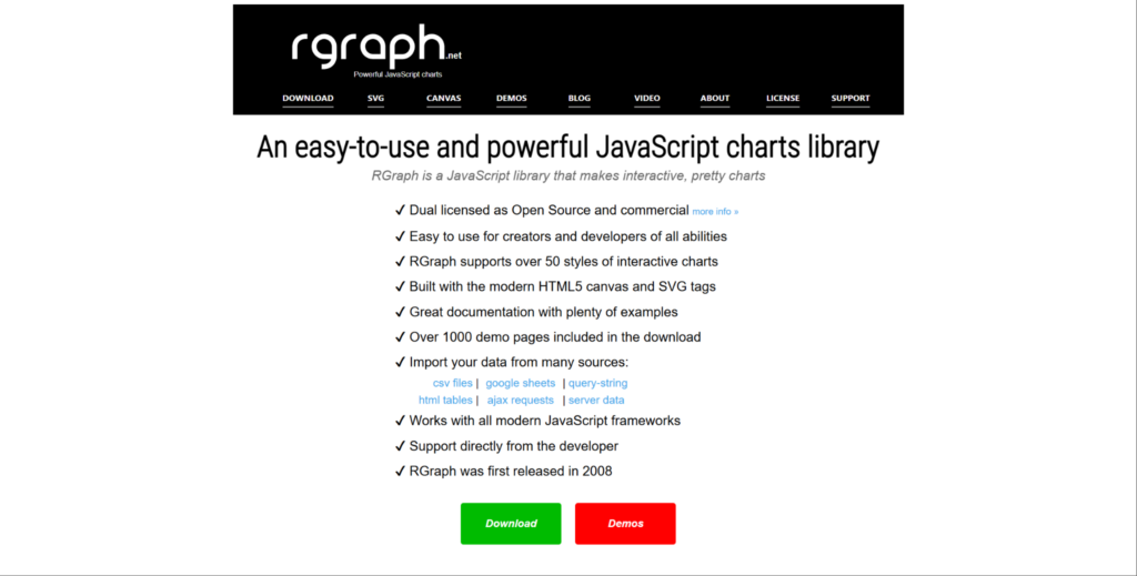
RGraph is a practical JavaScript charting option with multiple chart types and configuration choices. It suits dashboards, reports, internal tools, data panels, business interfaces, and lightweight analytics pages. The library can be useful for teams that want more control than a very simple chart library provides. It is not the first choice for extreme real-time workloads or scientific-grade visualization. RGraph makes sense when teams need adaptable charts without taking on a fully low-level visualization stack.
Some dashboard projects need several chart types, custom labels, styling, layout adjustments, and interaction settings, but not a full custom visualization framework. RGraph supports that middle ground by giving teams configurable charting options. It can help teams build practical dashboard screens rather than highly specialized data products. Teams should review documentation, browser behavior, and long-term fit before committing. Its main value is adjustable charting without the overhead of a fully custom system:
- Offers several chart types for dashboards, reports, and business pages;
- Gives teams control over chart settings, styling, labels, and visual behavior;
- Fits products that need more adjustment than basic chart components allow;
- Works for internal tools, reporting screens, and lightweight analytics interfaces;
- Makes sense when teams want configurable charts without fully custom development.
RGraph is useful when the dashboard needs more control than minimal libraries provide. It is less natural for teams that need heavy rendering, advanced chart families, or a large product analytics system. For a data-focused analytical charting style, Taucharts offers a different approach.
4. Taucharts
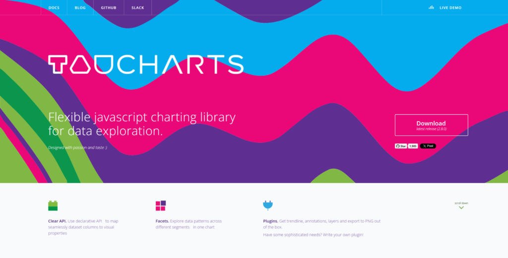
Taucharts is a more niche charting option for analytical dashboards and structured data views. It suits analytics screens, internal data tools, product reports, business dashboards, and exploration-focused interfaces. The library is more relevant when charts need to express data relationships clearly rather than simply decorate a dashboard. It is not a heavy rendering engine or a broad enterprise charting suite. Taucharts belongs in this list as a data-focused option for teams that want structured chart output.
Custom dashboard interfaces can be about data relationships, not only colors and interactions. Taucharts helps when the team wants a chart structure to follow the dataset and analytical logic. It may appeal to teams that like a more declarative or data-driven approach to charting. It is not the obvious pick for teams needing polished marketing-style dashboard charts or large-scale technical visualization. Its value is clearest in analytical screens where the structure of the data matters most:
- Supports analytical chart views for dashboards and internal data tools;
- Helps teams present relationships between data points more clearly;
- Fits products where the chart structure follows data logic and reporting needs;
- Works for internal dashboards, product reports, and exploration-focused screens;
- Makes sense when teams want a data-oriented charting approach.
Taucharts is useful for narrower analytical dashboard scenarios rather than broad product-wide charting systems. It may not be the first choice for advanced visuals, heavy rendering, or highly polished customer-facing dashboards.
Which Dashboard Charting Style Should You Choose?
The right choice depends on what kind of customization your dashboard actually needs. If the product needs custom interaction, advanced visuals, annotations, and large datasets, SciChart is the clearest option. If the main need is polished standard charts with quick implementation, ApexCharts may be more practical. If the team wants configurable charts for reports and internal dashboards, RGraph can be a reasonable middle option. If the dashboard is more analytical and data-relationship focused, Taucharts may suit that narrower use case. Test chart behavior with real data, expected interactions, and design requirements before choosing.
Final Thoughts
Custom dashboard interfaces require different types of charting tools depending on the product goal. SciChart is strongest when a dashboard needs advanced chart behavior, large datasets, annotations, and smooth interaction. ApexCharts is better for polished standard dashboards where visual quality and speed of implementation matter. RGraph suits teams that need configurable charts without building every visual detail manually. Taucharts is more relevant for analytical dashboards where the chart structure follows the data.
The right JavaScript chart library should match your dashboard’s real workload, not just the design mockup. Check data size, interaction patterns, styling requirements, framework fit, documentation, and long-term maintenance. Do not choose a library only because the demo looks good or the default charts are attractive. A simple tool can become limiting if the dashboard grows into a core product feature. The safest choice is the library that handles your product’s real data, real users, and real interface requirements.